CreativePublic has partnered with Fix The Photo to offer our members discounted photo editing tools and restoration services. Here are a few options below to review:
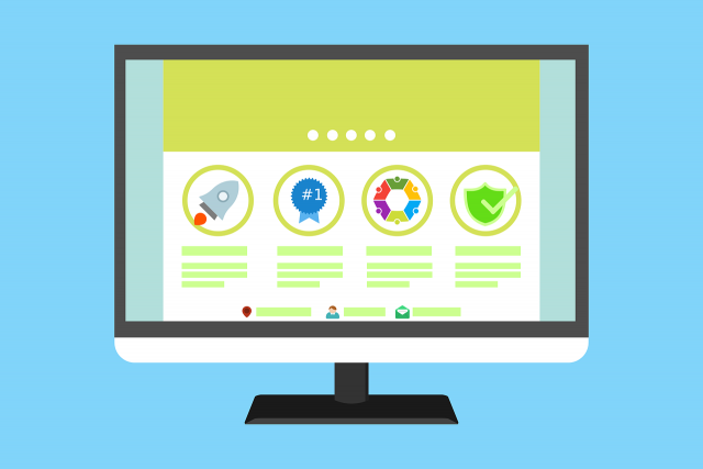
In today’s world, websites form an important part of most businesses. UI/UX design web content has emerged as necessities rather than luxuries for firms. Trained professionals are hired to take care of this aspect that makes the websites more engaging and attractive for users. UI/UX design webpages are very important to boost sales and garner profit.
Here are a few tips by which you can enhance the quality of
your web page.
Focus on the content on your website
As is the popular saying, Content is King. Users will not be impressed with fancy designs if the content in your website is substandard. Most UI/UX design tips include suggestions for improvement of the content. It should add to the UI/UX design web page and complement it. The site will be flawless only if it has great content in it.
Write the text in an engaging manner
Tips for UX design not only focus on the content but also on the way it is presented on your webpage. For the users to understand and connect with whatever it is that you have on your page, they need to be extremely well presented. Check the font size and spacing for UI/UX design inspiration. Make sure that the entire content is properly visible and looks attractive
Use contrasting colors and designs for more effective presentation
The choice of color and patterns are extremely important according to most UI/UX design agencies. Anyone with a UI/UX design course will be aware of the importance of contrasting colors on a public web page. This makes the content more attractive and pleasing to the eyes.
Use pictures and other pictorial representation smartly
According to most UX design tips, users connect more with
web pages that have a higher number of pictures. The inherent characteristics
of human beings are to understand graphs and pictorial representation of data
better than other forms. Thus, include pictures in your website wherever they
are relevant. It should not be abrupt and complement the topic. This way you
will be able to attract higher traffic to your website with ease
Make sure of the quality of the images that you use
One of the Fundamental UI design tips is to always use high
definition images. If not only makes your website look good but also makes sure
that people operating various browsers connect equally well with the content on
your web page. Using standard definition can often result in poor image quality
in some devices and browsers.
Employ an interactive design
Most UI/UX design agencies employ an interacting button system so that the people feel like they are clicking one on screen. Even though the purpose is served if you use just flat buttons, the webpage becomes less engaging and users lose interest pretty fast. An interactive user interface makes sure that all your visitors are converted into leads.
Use touch gestures to make your website more interactive
To make your web page more interactive and user-friendly,
you can use touch gestures in them. Add these gestures to visual
representations of data and graphical icons and you will achieve a higher level
of aesthetics on your website. Apart from making your page look attractive,
they will also act as a major fascination for visitors.
Boost your sales with a trained developing agency
Using these tips, you can easily improve the build quality of your UI/UX design webpage and attract more viewers. Get in touch with us to get the best web solutions and make sure that your website is unique and out of the box.
Conclusion
All the potential customers will perceive your website as the very first impression. Quality websites are a must for maintaining a robust online presence. Follow these UI/UX design web tips for attaining the best quality of your website pages. Get in touch with us today for availing finest services from our design experts who will create the best websites.
Author Bio:
Manan Ghadawala is a regular contributor to Writerzone.net and the founder of 21Twelve Interactive which is one of the best mobile app development company in India and the USA. He is an idealistic leader with a lively management style and thrives raising the company’s growth with his talents. He is an astounding business professional with astonishing knowledge and applies artful tactics to reach those imaginary skies for his clients. His company is also recognized by the Top Mobile App Development Companies.
They’re annoying, intrusive, and one of the
best forms of marketing your ecommerce site can employ.
Don’t believe me?These 30 ecommerce popups have helped their store owners retain customers, increase sales, and generate leads.
The fact is, popups (loathed as they are)
bring business, period.
But not all popups are created equal. While
regular popups are quickly dismissed and closed by the vast majority of
visitors (close to 99%), exit-intent popups are opened nearly ten times as
often.
Why?
Because they don’t get in the way. A regular
popup jumps in your face like a gypsy with an outstretched hand, demanding
money.
Instead, exit-intent popups wait by the door
as you’re leaving like a dog holding its leash in its mouth, just hoping you’d
like to take it for a walk. Or at least a pat on the head. How can you say No
to that face?
(I wasn’t planning on those metaphors when I
sat down to write this article, but here we are.)
Honestly though, exit-intent popups are
clicked nearly 10x as often just because of that: Because they’re not rude to
the visitor.
But that’s not the only reason they’re
clicked.
Here are the 5 best practices when it comes to
crafting a great exit-intent popup add.
1. Get Their
Attention
You might think a popup that suddenly appears
on-screen as soon as your visitor is about to leave the page has already gotten
their attention.
And it has. As a big square with an exit
button they must press.
To get them to actually read your popup, you have to call out to them. Words and phrases
like “Wait” and “Don’t Miss Out” are great ways to cause your visitor to
hesitate and see what’s so important you just had to get their attention.
But words aren’t the only way to intrigue
them. You can also do so visually. You can use pictures (like models, animals,
babies, motorcycles, you name it) that interest your target audience to get
them hooked.
And that’s not the only way to aesthetically
garner your audience’s attention. In fact, you pictures aren’t always
necessary.
What matters is making the design attract the
eye. Match the template, palette and “look” of your popup to the energy of your
brand and of your offer.
If you have a fashion site, make it sleek.
Selling vibrant accessories? Make it bold. Want them to sign up for your funny
newsletter? Make it whacky and ugly! (Appealing to the eye doesn’t always mean attractive. Ugly has its place in marketing, as
long as there’s a reason!)
Important
Tip: Make your popup match the tone of your brand, but have it visually contrast what’s already on the page. You don’t want it blending in!
2. Give Your
Audience Something Valuable
Don’t just ask them for their email address.
That’s just another form of begging.
And don’t just TELL them what they’re getting,
SHOW them! (And I don’t mean just with pictures, either. Paint a picture in
their mind!)
Tell
me, which sounds better to you?
Enter your email address and receive our
fantasy football newsletter every month.
Vs.
You league won’t know what hit’em. Get insider
news, trade discussions, injury reports, and in-depth analysis so you can have
bragging rights until next year… when you do it all over again.
Don’t lie to me and say the first one, either.
Talking about the features of an offer is one
thing (a discount, an informative newsletter, etc.). But talking about the benefits (the kind of life your visitor
will have if they take advantage of your offer) is what sells.
3. Get In Your
Visitor’s Head
Think about your visitor and how they got to
the page they’re currently on. Did they click an ad to get here? Are they on
the shopping cart page, getting cold feet about checking out? Are they reading
an article about exit-intent popups?
The visitor’s state of mind and virtual
environment are important things to consider when deciding what you’re going to
offer.
For example, on a checkout page, when a
potential customer might be re-thinking their purchase, having an exit-intent
popup offering them a 15% discount might be the difference between a sale and
an abandoned cart.
Think of it this way:
To get to where they are now, your visitor had
to take some kind of virtual journey. Your ad should be like the wise man on
the top of the mountain waiting for them and offering exactly what they need.
4. Give Them a Way
Out
Backing your visitor into a corner and
refusing to let them leave is bad for business.
While the X in the corner of the window can
always be clicked, it bolsters good faith in your brand if you give them a “No
Thanks” button so they can gracefully exit the popup while maintaining their
dignity.
Make this option smaller or less colorful so that
it’s less desirable, and you can increase click-throughs on your “Yes” button.
Whatever you do, just make sure to include it.
Morpheus gave Neo the option to take the blue
pill and wake up at home like nothing ever happened. Be like Morpheus.
5. A/B Test
Run two versions of your exit-intent popup and
see which one performs better. Then make a new one and have those two compete
against each other.
Repeat.
Make sure you do this with the forms on your
ad, too. Often, ads with an extra section to fill out will perform better than
an ad asking for less information.
It seems counterintuitive that it would be the
case, but it’s true. Sometimes, people like filling out a little more.
Plus, it’s a great way to get extra
information about your visitors’ demographic, which will help your sales in the
long run, too.
A/B Testing is invaluable. You never know when
a small tweak can bring in big results.
Always A/B Test your ads. Always, always,
always.
—
At the end of the day, popups get a bad reputation
from those who use them poorly. However, a well-timed, non-invasive popup can
actually be great for converting last-minute sign ups.
By following these five practices, you can
create popups that earn you more sign ups without feeling like a UX inconvenience
to your customers.
Thinking of building a website with WordPress but have no clue what it should be about? Don’t worry, there are plenty of ideas to try out. When starting anything, especially an online venture, you need to know what works and what doesn’t.
After all, you will be spending a great deal of time and (possibly) money on it, so you have to make sure you get a return on investment. With that said, keep on reading to discover 10 website ideas that you can try building with WordPress.
Why You Should Use WordPress
Before we dive into the WordPress website ideas, let us discuss why WordPress is definitely a go-to platform.
While there are many tools you can use to build a website, WordPress stands out for the following reasons:
User-friendly, especially for beginners;
The CMS is open-source and free;
Plenty of hosting possibilities. Many providers offer specialized WordPress web hosting for best possible performance;
Plenty of good free and premium plugins for endless customization and extending of functionality;
Plenty of excellent free and premium themes;
WordPress sites usually rank high in terms of search engine optimization (SEO);
The majority of themes are mobile responsive;
A dedicated community for support;
Try These 10 Great Website Ideas
Now that you know why WordPress is the top choice, here are 10 of the best WordPress website ideas.
1. Video Games
If you are a fan of video games, then consider writing a blog or making videos of them and uploading them to your WordPress website. You can do so many things in regards to video games, including walkthroughs, hints, tips, and reviews.
You can easily build a following, which you can also monetize through affiliate marketing (more on this later). And if you can live stream the gameplay, that can even get you more of a following.
2. E-Commerce
If you are looking for a way to make money selling products, then an e-commerce site is one of the best WordPress website ideas. Although you will have to work extra hard for the store to get noticed, it is worthwhile.
Once you overcome the slow buildup, your store will keep you well-fed perpetually. You can easily create such a website with WordPress and use a plugin like WooCommerce to process payments.
3. Learning Platform
Selling courses online has also become one of the top ways people make money these days. There is no shortage of free content that can teach people how to do anything.
However, everyone knows that some of the best content is paid content. If you’re highly skilled in something and can teach it, then you can make money online. WordPress is a good place to build a website to impart knowledge and skill at a price.
4. Affiliate Blog
An affiliate blog is made for the express purpose of promoting products for other people and businesses. You get an affiliate link, which you casually insert into the content (make sure it is relevant and engaging content).
When the reader clicks on that link and purchases the product, you get a commission. You have probably seen these types of blogs before. They usually have titles like “Top 10 Toaster Ovens to Buy in 2019.”
5. Job Boards
Many people go online to look for jobs – 39% of Americans are job seekers and 79% of them search for jobs online. And after tons of hours separating the wheat for the chaff, they find them. If only there was a premium service website that could simplify this process for them.
And with WordPress, you can create such a website where you can provide them with job listings with a high chance of getting hired. You can charge them a monthly fee to have access to the listings – you can even charge employers for posting listings.
6. Travel
People love reading about travel adventures, whether they are planning on taking a trip or not. So if you are constantly traveling, consider creating a WordPress website and writing about your travel experiences.
Make sure to also grab your camera and take breathtaking photos of important landmarks and great views. You can even provide people with travel tips, such as pre-flight checklists or must-visit sites in certain countries or regions.
7. Fashion
Some people have no sense of style, but if you do, then why not help them out? Fashion is something that will never go out of style cause people are always looking for the trendiest apparel and accessories.
This is one of the other great website ideas since you can also place affiliate links on the content. Once you establish yourself as an industry professional, your recommendations will carry a lot of weight.
8. Self-Help
The world is a stressful place, and everyone needs someone to teach them the art of getting by. Every day, people need help with something, and if it is something you have experience with, you can help them. You can offer actionable tips and advice or just let them know that they are not alone. Such a website is easy to create with WordPress and has the potential to gain a large following.
9. Cooking and Recipes
If you are a good cook who loves to try new recipes and experiment, then why not share your knowledge? Come up with your recipes and share tips on how to cook them.
You can easily create a cooking website with WordPress. And if you gain enough of an audience, you can even be approached to do paid reviews of cooking items.
Create any Kind of Website With WordPress
With WordPress, you can bring a lot of website ideas to life. No matter what you love, whether it is video games, traveling or cooking, WordPress allows you to create a website for them.
Even if you want to sell products or courses, WordPress supports that too. While this list is by no means exhaustive, these 9 WordPress website ideas are a good start.
Have you wondered, “How long should this page be?” A quick Google search gives you answers ranging from “300 words” to “5 paragraphs” to “as long as necessary — but not too long!”
None of these answers are very helpful. That’s mostly because page length doesn’t have a rule, it has guidelines. Here are a few myths to avoid and guidelines to follow when writing your page content.
Great web design is sometimes unfairly brushed off as a luxury only huge brands can afford to carry out successfully. Companies with generous design and marketing budgets usually do take full advantage of their options and provide users with great online experiences.
However, although it may seem like this is a major league game, even simple web design tweaks and investments can result in huge payoffs. In this article, we’ll explore how several companies managed to increase their revenue and conversions by implementing some of the current web design trends. The following case studies and tips based on research compiled by DesignAdvisor help illustrate the power of good web design, and how any business can wield it.
Make your site easy to navigate
The percentage of sales lost because customers can’t find what they require on a website goes as high as 50%. Nowadays, users online are accustomed to finding what they need quickly and easily so navigability is key. By improving their site’s architecture and ease of navigation, Botanica managed to increase sessions by 78%, page views by 102% and organic search traffic by 55%.
Provide easy access to information
A site’s search functionalities can help users find what they need in case they are unable to do so merely by browsing. If a search function in not implemented correctly or worse, missing entirely, the user’s overall perception of a website and the quality of their experience is likely to be negatively impacted. 60% of the time, when users can’t find information it’s due to poor search functionalities.
In the case of Volleyball BC, the sports site managed to increase user engagement by improving their search options. They implemented an advanced filtering system for searching results by game and team as well as searching events by location. As a result, the site saw a jump of 28% in visits and an increase in social referrals of over 500%.
Don’t forget about mobile devices
As more users migrate from laptops and desktops to mobile phones, companies failing to update their design to enable responsiveness to mobile devices are bound to see some adverse effects. Almost half of all users will take the fact that a website does not perform well on their phone as a sign that the business associated with it just doesn’t care enough.
HMT updated their site to fit mobile specifications and increased their monthly revenue by 159%; merely by introducing responsive web design, time spent on the site increased by 60%.
Speed up
Almost 50% of users think that a site should take no more than two seconds to load, and investing in meeting these expectations can have some very positive outcomes for a business. Allowing users to get to where they want to go faster helps you sell products and services. Shopzilla increased its conversion rate by 7-12% by simply getting their site to load 5 seconds faster. These small tweaks can clearly have significant impact on your business.
Check out plenty more trends, case studies and resources in the infographic below.
Movies and TV shows tend to use real food when they can, but there are a number of times when they need something fake. We spoke with two fake food artists who specialize in making custom, inedible treats for restaurants, trade shows, and Hollywood. Here’s how fake food props are made to look so delicious.