Thinking of building a website with WordPress but have no clue what it should be about? Don’t worry, there are plenty of ideas to try out. When starting anything, especially an online venture, you need to know what works and what doesn’t.
After all, you will be spending a great deal of time and (possibly) money on it, so you have to make sure you get a return on investment. With that said, keep on reading to discover 10 website ideas that you can try building with WordPress.
Why You Should Use WordPress
Before we dive into the WordPress website ideas, let us discuss why WordPress is definitely a go-to platform.
While there are many tools you can use to build a website, WordPress stands out for the following reasons:
User-friendly, especially for beginners;
The CMS is open-source and free;
Plenty of hosting possibilities. Many providers offer specialized WordPress web hosting for best possible performance;
Plenty of good free and premium plugins for endless customization and extending of functionality;
Plenty of excellent free and premium themes;
WordPress sites usually rank high in terms of search engine optimization (SEO);
The majority of themes are mobile responsive;
A dedicated community for support;
Try These 10 Great Website Ideas
Now that you know why WordPress is the top choice, here are 10 of the best WordPress website ideas.
1. Video Games
If you are a fan of video games, then consider writing a blog or making videos of them and uploading them to your WordPress website. You can do so many things in regards to video games, including walkthroughs, hints, tips, and reviews.
You can easily build a following, which you can also monetize through affiliate marketing (more on this later). And if you can live stream the gameplay, that can even get you more of a following.
2. E-Commerce
If you are looking for a way to make money selling products, then an e-commerce site is one of the best WordPress website ideas. Although you will have to work extra hard for the store to get noticed, it is worthwhile.
Once you overcome the slow buildup, your store will keep you well-fed perpetually. You can easily create such a website with WordPress and use a plugin like WooCommerce to process payments.
3. Learning Platform
Selling courses online has also become one of the top ways people make money these days. There is no shortage of free content that can teach people how to do anything.
However, everyone knows that some of the best content is paid content. If you’re highly skilled in something and can teach it, then you can make money online. WordPress is a good place to build a website to impart knowledge and skill at a price.
4. Affiliate Blog
An affiliate blog is made for the express purpose of promoting products for other people and businesses. You get an affiliate link, which you casually insert into the content (make sure it is relevant and engaging content).
When the reader clicks on that link and purchases the product, you get a commission. You have probably seen these types of blogs before. They usually have titles like “Top 10 Toaster Ovens to Buy in 2019.”
5. Job Boards
Many people go online to look for jobs – 39% of Americans are job seekers and 79% of them search for jobs online. And after tons of hours separating the wheat for the chaff, they find them. If only there was a premium service website that could simplify this process for them.
And with WordPress, you can create such a website where you can provide them with job listings with a high chance of getting hired. You can charge them a monthly fee to have access to the listings – you can even charge employers for posting listings.
6. Travel
People love reading about travel adventures, whether they are planning on taking a trip or not. So if you are constantly traveling, consider creating a WordPress website and writing about your travel experiences.
Make sure to also grab your camera and take breathtaking photos of important landmarks and great views. You can even provide people with travel tips, such as pre-flight checklists or must-visit sites in certain countries or regions.
7. Fashion
Some people have no sense of style, but if you do, then why not help them out? Fashion is something that will never go out of style cause people are always looking for the trendiest apparel and accessories.
This is one of the other great website ideas since you can also place affiliate links on the content. Once you establish yourself as an industry professional, your recommendations will carry a lot of weight.
8. Self-Help
The world is a stressful place, and everyone needs someone to teach them the art of getting by. Every day, people need help with something, and if it is something you have experience with, you can help them. You can offer actionable tips and advice or just let them know that they are not alone. Such a website is easy to create with WordPress and has the potential to gain a large following.
9. Cooking and Recipes
If you are a good cook who loves to try new recipes and experiment, then why not share your knowledge? Come up with your recipes and share tips on how to cook them.
You can easily create a cooking website with WordPress. And if you gain enough of an audience, you can even be approached to do paid reviews of cooking items.
Create any Kind of Website With WordPress
With WordPress, you can bring a lot of website ideas to life. No matter what you love, whether it is video games, traveling or cooking, WordPress allows you to create a website for them.
Even if you want to sell products or courses, WordPress supports that too. While this list is by no means exhaustive, these 9 WordPress website ideas are a good start.
Have you wondered, “How long should this page be?” A quick Google search gives you answers ranging from “300 words” to “5 paragraphs” to “as long as necessary — but not too long!”
None of these answers are very helpful. That’s mostly because page length doesn’t have a rule, it has guidelines. Here are a few myths to avoid and guidelines to follow when writing your page content.
Great web design is sometimes unfairly brushed off as a luxury only huge brands can afford to carry out successfully. Companies with generous design and marketing budgets usually do take full advantage of their options and provide users with great online experiences.
However, although it may seem like this is a major league game, even simple web design tweaks and investments can result in huge payoffs. In this article, we’ll explore how several companies managed to increase their revenue and conversions by implementing some of the current web design trends. The following case studies and tips based on research compiled by DesignAdvisor help illustrate the power of good web design, and how any business can wield it.
Make your site easy to navigate
The percentage of sales lost because customers can’t find what they require on a website goes as high as 50%. Nowadays, users online are accustomed to finding what they need quickly and easily so navigability is key. By improving their site’s architecture and ease of navigation, Botanica managed to increase sessions by 78%, page views by 102% and organic search traffic by 55%.
Provide easy access to information
A site’s search functionalities can help users find what they need in case they are unable to do so merely by browsing. If a search function in not implemented correctly or worse, missing entirely, the user’s overall perception of a website and the quality of their experience is likely to be negatively impacted. 60% of the time, when users can’t find information it’s due to poor search functionalities.
In the case of Volleyball BC, the sports site managed to increase user engagement by improving their search options. They implemented an advanced filtering system for searching results by game and team as well as searching events by location. As a result, the site saw a jump of 28% in visits and an increase in social referrals of over 500%.
Don’t forget about mobile devices
As more users migrate from laptops and desktops to mobile phones, companies failing to update their design to enable responsiveness to mobile devices are bound to see some adverse effects. Almost half of all users will take the fact that a website does not perform well on their phone as a sign that the business associated with it just doesn’t care enough.
HMT updated their site to fit mobile specifications and increased their monthly revenue by 159%; merely by introducing responsive web design, time spent on the site increased by 60%.
Speed up
Almost 50% of users think that a site should take no more than two seconds to load, and investing in meeting these expectations can have some very positive outcomes for a business. Allowing users to get to where they want to go faster helps you sell products and services. Shopzilla increased its conversion rate by 7-12% by simply getting their site to load 5 seconds faster. These small tweaks can clearly have significant impact on your business.
Check out plenty more trends, case studies and resources in the infographic below.
Venturing into the world of e-commerce? If you’re looking to become a driving force within your chosen market, it’s important you know how to do it. With so many people fighting to claim the top spot, these five tried and tested tips will ensure you’re ahead of the pack and growing exponentially and continuously, ensuring success for the future.
Have a good level of customer service
One of the best ways to attract new customers whilst keeping existing ones around is by ensuring you upkeep a great level of customer service. It’s the most important part of any business – if you’re offering constant communication and customer service, you’ll be ensuring you build those valuable consumer relationships which will keep your business thriving.
Ensure you have an easy, straightforward way for customers to get in touch in regard to products and services they may have queries about. A phone call is regularly said to be the most effective form of communication, building trust and relationships between businesses and customers – but an email is a good choice if a phone line isn’t feasible. So long as you’re able to communicate clearly with customers and establish yourselves as a reliable company, you’ll keep people coming back.
Ensure you’ve got the right hosting
First things first – you need to make sure you’re choosing the right level of hosting to suit your future goals. Are you looking to remain relatively niche, with a limited outreach that remains consistent? Or, do you want to keep getting bigger and bigger, with no limit in sight? If you’re reading this post, it’s likely the latter.
And so, with that being said, you need to consider which hosting provider to opt for. There are plenty out there to choose from, and it all comes down to your personal desires – should you want to grow exponentially, a dedicated server may be your best bet. Although it’s more expensive than a shared server, having your very own dedicated platform reduces the risk of overloading due to increased traffic, which could end up with significant downtime upon your site and effectively making customers look elsewhere.
Design your site to look appealing
Another way to grow your site and establish yourself as a worthwhile company is by ensuring your design is forward-thinking and easy to navigate, whilst also being visually appealing. Consider the appearance of your competitors and the frontrunners in your market – although it’s good to stand alone and excel from the crowd, you need to understand just what makes your neighbours so successful.
Flat, clean designs are all the rage on the internet currently, so consider stripping it back and letting your products do the talking – you’ll be sure to reap the benefits. Minimalism is in, and combined with responsive design you’ll undoubtedly get the best results.
There’s a difference between a niche market and niche marketing, and you need to be aiming for the latter. Where a niche market will limit you in terms of potential customers, as there’s less of a demand for the products you’ll be selling, niche marketing will have a completely opposite effect.
Niche marketing basically means you’ll be finding your own space in a market that is perhaps oversaturated with the same own. Stand out from the crowd and offer something new, and you’ll attract customers who are looking for the next big thing.
Make sure your site is secure
Another way to ensure your store doesn’t suffer any setbacks is by having a sufficient level of security to protect it. Attacks such as SQL injections are common upon online stores, and with the risk of things such as sensitive information being leaked, it’s important you’re doing all you can to prevent it.
If you do suffer any security breaches or attacks, it’s likely your customers will begin to look elsewhere as a result. Be sure to prevent anything that could prove to be detrimental to your success.
There are elements that make the best websites tick.
“How do they acquire and convert high-paying clients consistently?”
“What do these websites have that we don’t?”
These are the questions those who barely get any sales out of their website often ask.
In this article, we aim to uncover some of those reasons.
Surprisingly, some of them are easily overlooked and are just considered normal elements of a website when in fact they can be the difference between a successful sale and lost one.
The Basics
Before we talk about the elements, we must make sure that the basics are in place. By basics, we mean good on-page search engine optimization (SEO).
To name a few, good-on page SEO consists of good site architecture, a good keyword strategy, and a better than normal website loading speed.
Out of the three, a lot have hiccups on the site speed factor, especially on mobile. According to Google, the benchmark for website loading speed on mobile is three seconds.
If your website takes longer than three seconds to load, you might want to consider optimizing your loading speed.
You can also minify your HTML, CSS, and JavaScript codes.
Good on-page SEO equals a usable and reliable website for your visitors to use. A usable and reliable website is the foundation that goes hand-in-hand with the elements below.
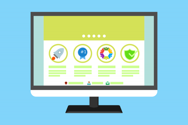
1. Social Proof
Robert Cialdini, the author of the book Influence: The Psychology of Persuasion, said that when people are uncertain, they tend to look at the actions and behaviors of others to determine their own.
We are more complacent to purchase something if it is used or endorsed by an influencer or accepted by society.
In a nutshell, social proof is something like this – “others say that this brand is awesome, so… this brand must be awesome”.
Think about it. We would be compelled to buy something from Amazon if it is rated five stars and has a lot of positive reviews.
There are different kinds of social proof depending on your industry and website. Moreover, some are more applicable for Business-to-Consumer (B2C) companies while some are leaning towards Business-to-Business (B2B) ones.
For those in the B2C space, social proof you can use on your website can be social media in the form of Facebook posts or tweets from customers.
On the other hand, B2B companies can leverage on testimonials from past and current clients to persuade future ones.
(Zoho, a CRM platform shows testimonials from brands that use their platform.)
Showcasing your client’s logos or media publications where you are mentioned in on your homepage is another good social proof for B2Bs. These are also known as trust icons.
(Salesforce, another CRM platform, showcases the brands that use their platform.)
2. Blog Platform
A blog can help build your brand’s thought leadership and expertise in the industry by providing relevant, informative, and useful content to your customers or clients.
When we see a brand publish noteworthy content on their blog, we consider them authoritative and competent on what they’re doing.
The content you publish in blogs helps nurture your customers as they go through the customer journey.
For example, you can publish blog posts aimed at generating awareness for your product or service.
On the other hand, you can also craft content that aims to remove doubt and last-minute questions to help your customers reach a purchasing decision.
Other than building thought leadership and lead nurturing, a blog is also a useful repository where you can store content that can help your website get found easier with Search Engine Optimization (SEO).
3. Consistent Call-to-action
The best websites are designed to have one end-goal or conversion in mind. Those conversions can be a sale or a sign-up on a lead generation form. These conversions depend on your industry, website, and whether you’re B2B or B2C.
For example, if you are a B2B website, your conversion can be a lead. Of course, the occasional inquiries that directly lead to a sale is good. But most of these big-ticket clients needs some nurturing before they buy.
If your aim is to generate leads, your website’s call-to-action and the copy must be consistent all throughout. Every page must be designed to lead to that end-goal.
(Ahrefs, a tool for marketers, communicates one call-to-action on their homepage.)
Some websites forget about these end-goals and add other call-to-actions or generate copy that makes the visitor ask “what do you want me to do?” or “where do you want me to click?”.
Or even worse, some websites even forget to add a call-to-action that often leads to a visitor leaving with no meaningful interactions with the website.
4. Lead Generation Mechanism
If a visitor lands on your website, lucky you! He or she chose your website instead of the countless others. But the challenge now is how to transform the visitor from a visitor to a paying consumer or client.
Not all visitors will convert on the spot, and this applies to both B2C and B2B companies. That’s a reality we all have to accept.
The visitor is interested in your product or service but there are a lot of factors that can influence his or her purchase like lack of money or lack of time to make the purchase itself.
You don’t want that interest to die down now that he or she is aware of your product or service, don’t you? Remember, awareness is hard to come by nowadays.
A useful element to add to a website that helps keep leads interested are lead generation forms. These forms are where visitors can opt-in in exchange for something of value like an ebook or a free trial of a software.
(FreshBooks provides a lead gen form where visitors can opt-in in exchange for a free trial.)
A lead generation form typically subscribes the visitor to an email newsletter. Email newsletters help your visitors navigate through the consumer journey by sending our targeted and well-timed emails depending on where they are on the journey.
For B2B companies, programmed emails help prospective clients learn more about the product or service on the awareness phase. This also helps them keep interested in the product or service.
On the flip side, sending an email that encourages your clients to renew a trial or consult with you if you are offering a service is effective in the consideration phase.
Conclusion
The four elements, when done and integrated right, can be powerful tools to increase and retain your customers and client base.
Found this article helpful? Help others learn more about these four elements by sharing this article.
For established websites with ample traffic and fantastic search engine rankings, the major challenge is updating site design to meet the latest algorithm without losing visitors. Google is now on a mission to rid the internet of poor content and design. Therefore, it’s essential your website displays content from the finest writers and incorporates SEO savvy designers if you want to avoid a Google penalty.
Regardless of niche, your website design should be stunning and visually appealing to online users. Google tweaks its’ algorithm on an almost daily basis, so it’s hard to keep up with SEO best practices when designing a website. Sadly, these mistakes will cost you traffic, site authority, page ranking, conversion and revenue.
Which web design mistake is affecting your site performance and ranking?
Poor technical SEO
The first step to conversion is attracting traffic to your website. Next, your site performance should be excellent if you want visitors to enjoy a positive user experience. This involves testing your site for mobile-friendliness, ease of navigation, page load speed and removal of all broken links. Your SEO will suffer if your site isn’t optimised for these features.
404 pages and missing H1 tags
Imagine taking the time to build a sumptuous website even the best designers would be impressed with. There’s a beautiful background, user-friendly font and colour scheme. Meanwhile, the browsing is simple and it all looks great , except that it’s not showing up on search engines.
Somehow, you’ve forgotten about H1 tags, a vital element for SEO. Google bots use the H1 tag to understand a webpage. Include this tag on your homepage and across your website if you want higher rankings. In addition to the H1 tag, add a target keyword for better clarity.
Using too much flash or frames on your site
Flash is attractive on a website, but not SEO friendly. Creating a homepage based on flash is a huge SEO blunder, as search engines index them poorly. When people see flash content, they can read the text within, but the only thing search engines see is a headline and nothing more.
Results from a recent poll show that 78% of respondents don’t like flash either, so why do you need to flood your site with flash ads? Chrome no longer auto-plays flash ads after finding it had a negative impact on users’ browsing experience.
Failing to optimise on-page elements and including important text in images
The most easily understood content for search engines is text. Videos, infographics and podcasts might gain more engagement, but when search engine spiders crawl your site, they’re looking for specific keywords in key locations.
Google’s official webmaster advises site owners to use text instead of images when displaying essential content, names or links. Google crawlers can’t identify text-in-images. This factor accounts for about 15% of Google’s Ranking algorithm. Where images are absolutely necessary, use ALT to add few words of descriptive text.
Infinite scroll
When incorrectly implemented, infinite scroll can hurt SEO performance. Content keeps loading as the user scrolls to the end of the page. Set up your pagination correctly or search engines can’t crawl your web pages.
For example, you have 200 pages on your blog, which is enabled for infinite scrolling. By default, if you only display 20 recent posts, that’s all search engines bots will see. They crawl links, so there’s no way to see past the top 20 articles. Thankfully, Google’s Webmaster Blog offers a few insights for making infinite scroll pages more search-friendly.
Intrusive and irrelevant pop-up ads
Pop-ups aren’t indexed by search engines, nor should they be part of your web design. In fact, Chrome blocks them from appearing. Most online users also find pop-ups annoying. If one appears on the screen while you’re browsing, you’ll probably close it before reading the content. However, digital marketers say they’re great tools for increasing subscriber base and email lists.
It’s possible to display popups, increase sales and followers without hurting your SEO. Dan Zarrella and Entrepreneur.com are two successful examples. The key is to ensure the popup is relevant and unobstructed. Offer your visitor a mouth-watering offer that makes them forget the intrusion. Don’t be pushy, but always provide value to the user when displaying pop-ups. Examples include a product discount or free ebook.
Thin content
Your product and service pages are the most essential on your site. You’ll drive more business sales if you rank higher for keywords from your services and product pages. A few mistakes web owners make include:
No product or service page on their website: when you fail to include these pages, you lose the unique opportunity for organic ranking, related to your target keywords.
One-page listing for multiple products: as a thumb of SEO rule, only have one keyword on each page. This helps search engines properly understand the page and how to rank it. Your website becomes confusing when you pack several services or products on the same page, which causes you to lose ranking points.
Small text on your product/service pages: When you’ve chosen product/services pages to include on your site, create content or copies to accompany them. Descriptive content that highlights the benefits of buying the product from you helps the pages to rank higher and increases the chances of visitors shopping from your online store.
Other SEO factors that cause Google to penalise you include:
Keyword domains: domain names aren’t risky on their own, but using keywords in your domain name might be dangerous. If you repeatedly link to the anchor text, Google sees it as a manipulation. To prevent this, ensure you have quality content on your site when using exact match domains. There are sites like Domain Names NZ offering services that won’t cost you SEO points.
Neglecting Hreflang: This is a tool designed to notify Google when you intentionally publish duplicate content for different languages.
Renting links
Overpopulating your web page with every design element you can find
Redesigning you site without updating SEO
Failing to upgrade to HTTPS
Conclusion
Your web development, design and SEO experts should work together to create an outstanding experience for the user, because that’s all Google really wants. When upgrading your site or performing a major redesign, don’t focus on deadlines, but think about how to maintain your engagement levels, traffic and site rankings.
A well designed website attracts more visits, have more activities, have better on-site time and rank higher on search results. Your site can’t achieve this if you’re still stuck in the last era characterized by desktop-only optimized site, regular layouts, dull colors, tiny fonts, slow responsiveness and loading speed…
You may be able to create an attractive website by hiring a professional web designer or developer, but to make it truly functional and achieve your online goals, it’s important that, in addition; you get the services of a good SEO specialist.
It’s difficult to balance functionality and great content with aesthetics, but that’s the only way you can reduce bounce rates on your website and boost user experience – which are key to avoid being penalized by Google and other major search engines. For a 21st century website, here are 7 important trends to follow.
1. Mobile-friendly site
Google index mobile devices first, which gives the advantage to mobile-friendly sites in the 21st century. A report showed that mobile phone users were responsible for more than 43% of traffic on the World Wide Web in 2016 alone. The year 2015 experienced a bit above 35%. This means that by 2020, more than 75% of the traffic on the internet will come from mobile devices.
With that in mind, it’s only wise to design your website to fit the screens of smartphones and maybe tablets. As Google rolls out the mobile first index, sites that are accessible via mobile devices will rank higher than those that aren’t. As for that, you need to choose a fast hosting if you want to create a mobile-friendly site.
To make it easy for websites, Google also introduced the Accelerated Mobile Pages (AMP) – an open source project that makes it easy for websites to load more easily and faster on phones and tablets. The AMP strips down code for traditional mobile sites, runs scripts in parallel and used external resource for media files. Take advantage of this open source coding standard to boost conversion rate.
2. Progressive web apps
Web designers and software engineers have begun to work together to blend the web and app into one. Since apps are a main part of mobile usage, incorporating it into your website will definitely boost user experience. Some sites have already started adding elements like splash screen, push notifications and animated page transition. The good part about the progressive web app is that you won’t need to install it before use. It also loads quickly and is very easy to use.
3. Responsive design
There’s no way anyone can talk about web design and not include responsiveness somehow. It’s almost gone from just a trend to a principle. Having a responsive web design means setting up your website to fit into the screen of mobile phones, desktops, TVs, tablets and other browsing devices. In as much as this has become very common and possible for every regular website, it’s expected that Virtual Reality, Augmented Reality and other new forms of technology will also key into the trend.
4. Bold Fonts & Bright Colors
No matter how well set up your website is, you need a bold font to get your visitors captivated and focused on your content. Make it easy to read and that it stands out in the white space. A survey showed that people who read digital content have a very low attention span. This means that web visitors are likely to just take a look at what’s on your welcome page for a few seconds and if they aren’t captivated, they bounce off to another competitor’s site. So, use fonts and colors that make everything unique. Since you are aiming to convert visitors to subscribers or loyal customers, look for the right font and design that will keep them for as long as possible.
The good thing with fonts is that they look like images and take up less space. Photos slow down the loading speed of your website, but fonts scale the size of your topography without having any effect on the performance of the site. In fact, fonts and bright colors make your call-to-actions (CTA) more pronounced by creating clean lines on the pages of your website.
Besides, if you take a look at many websites these days, you won’t find the once popular clickable images, hero images and large icons any more. This is because larger typographical expressions are pretty much taking over.
5. Scrolled animations triggers
Users are more likely to scroll down some more when they are engaged by advanced triggered animations. These scrolled animation triggers have been around for a while, but there are new ways they are being used by modern websites.
Look for animation triggers that boost conversion rate. Strategic, educational and minimalist types are usually the best. These triggers also give your site a feel of uniqueness. It’s better than just having menus and buttons scattered all over the pages of your site.
6. Irregular grid layouts
The design theory of giving each page on your website its own theme by combining all the elements on the pages together with the help of grid layouts have been used by web designers in the past. WordPress and other Content Management Systems (CMS) use grid layout to design their templates. But recently, the way it’s being used is different.
Web designers had more options for grid layout design when the CSS grid was introduced in 2017. This gave them the chance to create a more modern style of design by using irregular layouts and neutral space that makes content easy to navigate and scan through.
7. Increase in micro-interactions usage
Since the use of social media networking sites like Facebook, Twitter and Instagram keeps growing by the day, micro-interactions have started gaining popularity. Users no longer want to just like a post or comment. They want to be able to use emojis and animated icons to show how they feel about a write up, a photo or even when sending private messages.
Formerly, pages refresh when you click on fluffy animated icons. This usually discourages visitors from getting fully engaged on the page content. But including these micro-Interactions in the interactive portion of a website will boost the site’s user experience and certainly increase conversion rate.
A decade ago I started a web design company. We grew and grew, and after ten years of hard work, I’ve finally been able to get rid of it.
Don’t get me wrong – we were successful, had fun and did good work. At our peak we had over 200 clients and 15 fulltime staff, making us the largest such company in our city. We’ve worked on great projects for some big name clients and we even made some money too.
Little by little however, the years ate away at my soul. This year we finally left it all behind and moved onto our own products, and I’ve never been happier.
So this is why.
Web design isn’t all bad
Web design is not without its benefits. Client work is endlessly varied, and you’re always learning new things.
It’s a ludicrously easy industry to enter too – all you need is a computer, Internet access and time. There’s plenty of demand for cheap work to get you started, and fair rates for good work if you can do it.
I started Silktide fresh out of University with no computer and £14,000 (about $22,000) of debt. And though it was hard from the start, we were able to double in size every year, and all our work led to better work. Our efforts were continually rewarded as we grew.
As a web designer you need to constantly stock up on fonts, logos, stock photography, graphics etc., and you need to rely on tools to get your work done efficiently and successfully. Here is a list of the top 100 web design resources to help you as a web designer stay on top of your game. This list of 100 web design tools range from the best color palettes, logos and finding the right visual assets, to choosing the perfect typography.
I wanted to send out an update about CreativePublic’s YouTube Channel. I am planning on adding new content over the next month with new videos. From this point forward, all video related content will be published on my YouTube channel.
The purpose of reviving this channel is to help bring education on design business to a wider audience and being able to start a conversation with my site members. This will be a great platform for all of us to engage about design business, including how to price your projects to selling your design services and more.