
The Logo Design Revolution
Posted: September 16th, 2018 | Author: admin | Filed under: Design, Really Cool Stuff | Tags: corporate identity, logo, logo design, logos | No Comments »The fields of graphic design and semiotics are inextricably linked. In this way, the first logo creators were most likely the ancient Egyptians, who designed images to convey socio-cultural values and established visual codes of representation. But as the industrial revolution began to give rise to consumer culture as we know it, logo design remained mostly utilitarian; images that represented brands often depicted either the product, the service, or something related to its manufacture, such as a factory.
Then came Paul Rand with his iconic rendering of the IBM logo in 1956. Many design historians see this as the definitive turning point in logo design. Shortly thereafter, Ivan Chermayeff and Tom Geismar founded a design firm that would take things one step further.
Webflow – Design and Develop Websites at the Same Time
Posted: August 18th, 2018 | Author: admin | Filed under: Design, Software | No Comments »The power to design, build, and launch responsive websites visually, while writing clean, semantic code for you.
Art Space Design Launches New Website
Posted: June 27th, 2018 | Author: admin | Filed under: Business, Design, Quick Blurbs | No Comments »![]()
Need help with a website? How about WordPress Development? We can help:
This Stunning Image Made With Pure Code
Posted: June 25th, 2018 | Author: admin | Filed under: Design, Really Cool Stuff | Tags: code, css, css images, html, interface design, pure css, pure css francine | No Comments »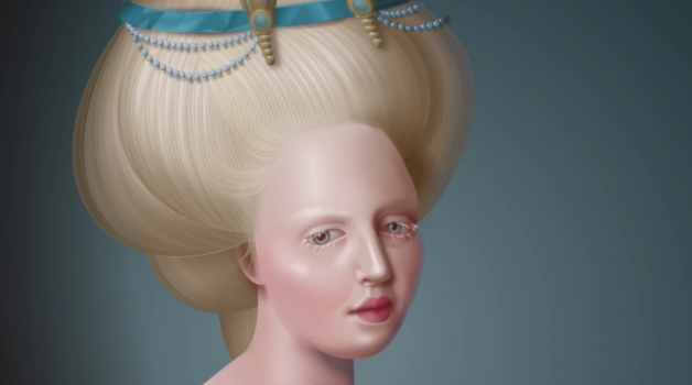
Diana Smith makes web images unlike any you’ve probably seen before. That’s because when you’re looking at one of the user interface designer’s creations, you’re not looking at flat pixel data fetched from a server—you’re looking at pure code, rendered live before your very eyes.
Smith’s “Pure CSS Francine,” an elaborate code-drawing in the style of an 1800s oil painting, caused web developers on Twitter to have a meltdown this week. The work was not drawn with a tablet, or a mouse, or even using illustration software. Instead, Smith coded every element by hand in HTML and CSS, computer languages that tell your browser how to display web pages. This means that there is no “image” to save as a file when you view Pure CSS Francine on the web, but you can screenshot it or download the code and play around with it yourself.
How doing a drawing a day changed my life: David Litchfield at TEDxBedford
Posted: June 25th, 2018 | Author: admin | Filed under: Design | Tags: drawing, graphic design, illustration, TEDx | No Comments »How to boost your online store to the top: 5 methods
Posted: June 4th, 2018 | Author: admin | Filed under: Articles, Business, Design | Tags: customer service, ecommerce, products, sell online, shopping cart, Web Design, web hosting, website | No Comments »
Venturing into the world of e-commerce? If you’re looking to become a driving force within your chosen market, it’s important you know how to do it. With so many people fighting to claim the top spot, these five tried and tested tips will ensure you’re ahead of the pack and growing exponentially and continuously, ensuring success for the future.
Have a good level of customer service
One of the best ways to attract new customers whilst keeping existing ones around is by ensuring you upkeep a great level of customer service. It’s the most important part of any business – if you’re offering constant communication and customer service, you’ll be ensuring you build those valuable consumer relationships which will keep your business thriving.
Ensure you have an easy, straightforward way for customers to get in touch in regard to products and services they may have queries about. A phone call is regularly said to be the most effective form of communication, building trust and relationships between businesses and customers – but an email is a good choice if a phone line isn’t feasible. So long as you’re able to communicate clearly with customers and establish yourselves as a reliable company, you’ll keep people coming back.
Ensure you’ve got the right hosting
First things first – you need to make sure you’re choosing the right level of hosting to suit your future goals. Are you looking to remain relatively niche, with a limited outreach that remains consistent? Or, do you want to keep getting bigger and bigger, with no limit in sight? If you’re reading this post, it’s likely the latter.
And so, with that being said, you need to consider which hosting provider to opt for. There are plenty out there to choose from, and it all comes down to your personal desires – should you want to grow exponentially, a dedicated server may be your best bet. Although it’s more expensive than a shared server, having your very own dedicated platform reduces the risk of overloading due to increased traffic, which could end up with significant downtime upon your site and effectively making customers look elsewhere.
Design your site to look appealing
Another way to grow your site and establish yourself as a worthwhile company is by ensuring your design is forward-thinking and easy to navigate, whilst also being visually appealing. Consider the appearance of your competitors and the frontrunners in your market – although it’s good to stand alone and excel from the crowd, you need to understand just what makes your neighbours so successful.
Flat, clean designs are all the rage on the internet currently, so consider stripping it back and letting your products do the talking – you’ll be sure to reap the benefits. Minimalism is in, and combined with responsive design you’ll undoubtedly get the best results.
Also be sure to remove any elements of your design that could harm your ranking—everything from the wrong header tags to intrusive pop-ups could lead to penalisation.
Employ “niche marketing”
There’s a difference between a niche market and niche marketing, and you need to be aiming for the latter. Where a niche market will limit you in terms of potential customers, as there’s less of a demand for the products you’ll be selling, niche marketing will have a completely opposite effect.
Niche marketing basically means you’ll be finding your own space in a market that is perhaps oversaturated with the same own. Stand out from the crowd and offer something new, and you’ll attract customers who are looking for the next big thing.
Make sure your site is secure
Another way to ensure your store doesn’t suffer any setbacks is by having a sufficient level of security to protect it. Attacks such as SQL injections are common upon online stores, and with the risk of things such as sensitive information being leaked, it’s important you’re doing all you can to prevent it.
If you do suffer any security breaches or attacks, it’s likely your customers will begin to look elsewhere as a result. Be sure to prevent anything that could prove to be detrimental to your success.
4 Elements Your Website Needs so You Can Land High-Paying Clients
Posted: May 29th, 2018 | Author: admin | Filed under: Articles, Business, Design | Tags: Blog Platform, Call-to-action, lead generation, Lead Generation Mechanism, Social Proof, Web Design, website | No Comments »
There are elements that make the best websites tick.
“How do they acquire and convert high-paying clients consistently?”
“What do these websites have that we don’t?”
These are the questions those who barely get any sales out of their website often ask.
In this article, we aim to uncover some of those reasons.
Surprisingly, some of them are easily overlooked and are just considered normal elements of a website when in fact they can be the difference between a successful sale and lost one.
The Basics
Before we talk about the elements, we must make sure that the basics are in place. By basics, we mean good on-page search engine optimization (SEO).
To name a few, good-on page SEO consists of good site architecture, a good keyword strategy, and a better than normal website loading speed.
Out of the three, a lot have hiccups on the site speed factor, especially on mobile. According to Google, the benchmark for website loading speed on mobile is three seconds.
If your website takes longer than three seconds to load, you might want to consider optimizing your loading speed.
Using a CDN can help speed up the delivery of your webpage content to your users.
You can also minify your HTML, CSS, and JavaScript codes.
Good on-page SEO equals a usable and reliable website for your visitors to use. A usable and reliable website is the foundation that goes hand-in-hand with the elements below.
1. Social Proof
Robert Cialdini, the author of the book Influence: The Psychology of Persuasion, said that when people are uncertain, they tend to look at the actions and behaviors of others to determine their own.
We are more complacent to purchase something if it is used or endorsed by an influencer or accepted by society.
In a nutshell, social proof is something like this – “others say that this brand is awesome, so… this brand must be awesome”.
Think about it. We would be compelled to buy something from Amazon if it is rated five stars and has a lot of positive reviews.
There are different kinds of social proof depending on your industry and website. Moreover, some are more applicable for Business-to-Consumer (B2C) companies while some are leaning towards Business-to-Business (B2B) ones.
For those in the B2C space, social proof you can use on your website can be social media in the form of Facebook posts or tweets from customers.
On the other hand, B2B companies can leverage on testimonials from past and current clients to persuade future ones.

(Zoho, a CRM platform shows testimonials from brands that use their platform.)
Showcasing your client’s logos or media publications where you are mentioned in on your homepage is another good social proof for B2Bs. These are also known as trust icons.

(Salesforce, another CRM platform, showcases the brands that use their platform.)
2. Blog Platform
A blog can help build your brand’s thought leadership and expertise in the industry by providing relevant, informative, and useful content to your customers or clients.
When we see a brand publish noteworthy content on their blog, we consider them authoritative and competent on what they’re doing.
The content you publish in blogs helps nurture your customers as they go through the customer journey.
For example, you can publish blog posts aimed at generating awareness for your product or service.
On the other hand, you can also craft content that aims to remove doubt and last-minute questions to help your customers reach a purchasing decision.
Other than building thought leadership and lead nurturing, a blog is also a useful repository where you can store content that can help your website get found easier with Search Engine Optimization (SEO).
3. Consistent Call-to-action
The best websites are designed to have one end-goal or conversion in mind. Those conversions can be a sale or a sign-up on a lead generation form. These conversions depend on your industry, website, and whether you’re B2B or B2C.
For example, if you are a B2B website, your conversion can be a lead. Of course, the occasional inquiries that directly lead to a sale is good. But most of these big-ticket clients needs some nurturing before they buy.
If your aim is to generate leads, your website’s call-to-action and the copy must be consistent all throughout. Every page must be designed to lead to that end-goal.

(Ahrefs, a tool for marketers, communicates one call-to-action on their homepage.)
Some websites forget about these end-goals and add other call-to-actions or generate copy that makes the visitor ask “what do you want me to do?” or “where do you want me to click?”.
Or even worse, some websites even forget to add a call-to-action that often leads to a visitor leaving with no meaningful interactions with the website.
4. Lead Generation Mechanism
If a visitor lands on your website, lucky you! He or she chose your website instead of the countless others. But the challenge now is how to transform the visitor from a visitor to a paying consumer or client.
Not all visitors will convert on the spot, and this applies to both B2C and B2B companies. That’s a reality we all have to accept.
The visitor is interested in your product or service but there are a lot of factors that can influence his or her purchase like lack of money or lack of time to make the purchase itself.
You don’t want that interest to die down now that he or she is aware of your product or service, don’t you? Remember, awareness is hard to come by nowadays.
A useful element to add to a website that helps keep leads interested are lead generation forms. These forms are where visitors can opt-in in exchange for something of value like an ebook or a free trial of a software.
(FreshBooks provides a lead gen form where visitors can opt-in in exchange for a free trial.)
A lead generation form typically subscribes the visitor to an email newsletter. Email newsletters help your visitors navigate through the consumer journey by sending our targeted and well-timed emails depending on where they are on the journey.
For B2B companies, programmed emails help prospective clients learn more about the product or service on the awareness phase. This also helps them keep interested in the product or service.
On the flip side, sending an email that encourages your clients to renew a trial or consult with you if you are offering a service is effective in the consideration phase.
Conclusion
The four elements, when done and integrated right, can be powerful tools to increase and retain your customers and client base.
Found this article helpful? Help others learn more about these four elements by sharing this article.
Freelance My Way
Posted: March 4th, 2018 | Author: admin | Filed under: Design | Tags: design, freelance, freelance design, freelance work, full-time freelance, graphic design, parr-time freelance | No Comments »Check out this new freelance site. They provide handpicked freelancers, ready to work on projects. Contact them to post a job or to become a freelancer.
At FreelanceMyWay they screen all freelancers before they can bid on jobs and get hired by the clients. All freelancers must go through a 3 step process before becoming a member. They want to focus on quality jobs, freelancers and excellent customer support. They have logo designers, php programmers, writers, data entry, seo and marketing jobs available.
7 Web Design Trends Every 21st Century Website Should Follow
Posted: February 2nd, 2018 | Author: admin | Filed under: Design | Tags: design trends, trending, Web Design, web design trends, website, website design | No Comments »
A well designed website attracts more visits, have more activities, have better on-site time and rank higher on search results. Your site can’t achieve this if you’re still stuck in the last era characterized by desktop-only optimized site, regular layouts, dull colors, tiny fonts, slow responsiveness and loading speed…
You may be able to create an attractive website by hiring a professional web designer or developer, but to make it truly functional and achieve your online goals, it’s important that, in addition; you get the services of a good SEO specialist.
It’s difficult to balance functionality and great content with aesthetics, but that’s the only way you can reduce bounce rates on your website and boost user experience – which are key to avoid being penalized by Google and other major search engines. For a 21st century website, here are 7 important trends to follow.
1. Mobile-friendly site
Google index mobile devices first, which gives the advantage to mobile-friendly sites in the 21st century. A report showed that mobile phone users were responsible for more than 43% of traffic on the World Wide Web in 2016 alone. The year 2015 experienced a bit above 35%. This means that by 2020, more than 75% of the traffic on the internet will come from mobile devices.
With that in mind, it’s only wise to design your website to fit the screens of smartphones and maybe tablets. As Google rolls out the mobile first index, sites that are accessible via mobile devices will rank higher than those that aren’t. As for that, you need to choose a fast hosting if you want to create a mobile-friendly site.
To make it easy for websites, Google also introduced the Accelerated Mobile Pages (AMP) – an open source project that makes it easy for websites to load more easily and faster on phones and tablets. The AMP strips down code for traditional mobile sites, runs scripts in parallel and used external resource for media files. Take advantage of this open source coding standard to boost conversion rate.
2. Progressive web apps
Web designers and software engineers have begun to work together to blend the web and app into one. Since apps are a main part of mobile usage, incorporating it into your website will definitely boost user experience. Some sites have already started adding elements like splash screen, push notifications and animated page transition. The good part about the progressive web app is that you won’t need to install it before use. It also loads quickly and is very easy to use.
3. Responsive design
There’s no way anyone can talk about web design and not include responsiveness somehow. It’s almost gone from just a trend to a principle. Having a responsive web design means setting up your website to fit into the screen of mobile phones, desktops, TVs, tablets and other browsing devices. In as much as this has become very common and possible for every regular website, it’s expected that Virtual Reality, Augmented Reality and other new forms of technology will also key into the trend.
4. Bold Fonts & Bright Colors
No matter how well set up your website is, you need a bold font to get your visitors captivated and focused on your content. Make it easy to read and that it stands out in the white space. A survey showed that people who read digital content have a very low attention span. This means that web visitors are likely to just take a look at what’s on your welcome page for a few seconds and if they aren’t captivated, they bounce off to another competitor’s site. So, use fonts and colors that make everything unique. Since you are aiming to convert visitors to subscribers or loyal customers, look for the right font and design that will keep them for as long as possible.
The good thing with fonts is that they look like images and take up less space. Photos slow down the loading speed of your website, but fonts scale the size of your topography without having any effect on the performance of the site. In fact, fonts and bright colors make your call-to-actions (CTA) more pronounced by creating clean lines on the pages of your website.
Besides, if you take a look at many websites these days, you won’t find the once popular clickable images, hero images and large icons any more. This is because larger typographical expressions are pretty much taking over.
5. Scrolled animations triggers
Users are more likely to scroll down some more when they are engaged by advanced triggered animations. These scrolled animation triggers have been around for a while, but there are new ways they are being used by modern websites.
Look for animation triggers that boost conversion rate. Strategic, educational and minimalist types are usually the best. These triggers also give your site a feel of uniqueness. It’s better than just having menus and buttons scattered all over the pages of your site.
6. Irregular grid layouts
The design theory of giving each page on your website its own theme by combining all the elements on the pages together with the help of grid layouts have been used by web designers in the past. WordPress and other Content Management Systems (CMS) use grid layout to design their templates. But recently, the way it’s being used is different.
Web designers had more options for grid layout design when the CSS grid was introduced in 2017. This gave them the chance to create a more modern style of design by using irregular layouts and neutral space that makes content easy to navigate and scan through.
7. Increase in micro-interactions usage
Since the use of social media networking sites like Facebook, Twitter and Instagram keeps growing by the day, micro-interactions have started gaining popularity. Users no longer want to just like a post or comment. They want to be able to use emojis and animated icons to show how they feel about a write up, a photo or even when sending private messages.
Formerly, pages refresh when you click on fluffy animated icons. This usually discourages visitors from getting fully engaged on the page content. But including these micro-Interactions in the interactive portion of a website will boost the site’s user experience and certainly increase conversion rate.