We all love free products to help us personally and professionally. But when it comes to free website builders, they’re not necessarily the best things to consider. While free web builders have their advantages in terms of a free website and the many free templates that come with them, there are many more disadvantages stacked up against them.
Website Builders Often Come Branded
It’s great for small businesses to be able to get their website online quickly and in the cheapest possible manner. However, free web builders often need to be linked back to the builder so your website will look unprofessional. Usually, at the bottom of your site, you will have a “powered by” link, and that generally consists of “Powered By Free Website Builder”. It doesn’t look professional at all and it will make customers think you’re not serious.
Such Builders Aren’t as “Free” as They Make Out
While the setup of a website using the builder’s features is often free, there are many other features that you could benefit from that aren’t free. For example, builders will give you disk space and bandwidth to keep your website online. However, you will usually miss out on other features such as email accounts, MySQL database, and sometimes even a parked/addon domain name – which means you’ll have to use their subdomain as well.
Limited Storage
We stated above that features are very limited and the storage and bandwidth often given to you aren’t beneficial. It will often run out quickly and that means your website is either going to go down or you’re going to be unable to upload additional content until you pay for extra features.
Limited Customization
Free Web Builders often make out they are easily customizable, and while that may be true, customization is limited. This means that you can only be as creative as the tool allows, which is something that puts many webmasters off. You will never get the chance to create that dream website you have set out to achieve, and in reality, the only way of achieving such a website is to get it custom made or take advantage of the many other resources out there.
Additional Advertisements
You will get the “powered by” link at the bottom of your site as basic, but some builders also require you to place advertisements. This isn’t at all professional, and often, you will have to advertise one of your competitors.
Free website builders, of course, provide many other benefits, but from looking at the disadvantages above, it would be much wiser to consider a free WordPress theme on a WordPress CMS installation. You’ll get more freedom and when your business grows you’ll also have access to premium themes.
If you have an online masters in business administration (online MBA), you will already know how important presentation is to a business. If you don’t have a degree, presentation of a website is the key to the success of any business.
Free web builders don’t give off the professional presentation that is often desired by customers, but they do provide many other benefits for smaller businesses on a tight budget, so they can be considered in that respect. You can also use web builders to create blogs but you should consider using WordPress; learn how to start a blog.
A decade ago I started a web design company. We grew and grew, and after ten years of hard work, I’ve finally been able to get rid of it.
Don’t get me wrong – we were successful, had fun and did good work. At our peak we had over 200 clients and 15 fulltime staff, making us the largest such company in our city. We’ve worked on great projects for some big name clients and we even made some money too.
Little by little however, the years ate away at my soul. This year we finally left it all behind and moved onto our own products, and I’ve never been happier.
So this is why.
Web design isn’t all bad
Web design is not without its benefits. Client work is endlessly varied, and you’re always learning new things.
It’s a ludicrously easy industry to enter too – all you need is a computer, Internet access and time. There’s plenty of demand for cheap work to get you started, and fair rates for good work if you can do it.
I started Silktide fresh out of University with no computer and £14,000 (about $22,000) of debt. And though it was hard from the start, we were able to double in size every year, and all our work led to better work. Our efforts were continually rewarded as we grew.
As a freelancer, owning a smartphone is a necessity; You have to be reachable, able to access data, and able to work at any given moment. However, if you’re still unsure of how a smartphone is good for business, check out these six smart ways to use your smartphone in freelancing.
Being connected to the internet wherever you go is crucial to many freelancers. Having internet access on the go lets you check emails, get directions, pull up files, and more. Sure you can get connected by grabbing your laptop and connecting to free Wi-Fi at your favorite coffee shop, but you may also have business needs come up in your car, the park, or at a restaurant. If you get a great cell phone that is hooked up to a good network, you’ll never again be stuck without internet service. Consider connecting with T-Mobile as it has an expansive network and provides uninterrupted service nationwide, making it perfect for your freelance business.
Close Contact with Clients
A freelancer depends on winning over enough clients to stay constantly busy and earn a living. You can’t win over clients if they can’t reach you, and a smartphone ensures you’re always available to your customers and potential clients. In addition to making you easily accessible by phone, a smartphone gives you always-on access to texting and email. No freelancer can be without a cell phone and expect to be successful.
Professional Voicemail
When you can’t get to the phone to answer calls from your clients, it is important to present a professional front. All smartphones allow you to set up a voicemail account. You can customize the greeting with as few or many details as you choose. Customers will be grateful for the clarity in knowing who they are leaving a message for and any other details you share. Remember, for your voicemail to be an effective freelancing tool, you need to return calls promptly.
Mobile Portfolio
Imagine showing up at a potential client’s office to show them your work, and for whatever reason, your computer won’t turn on — there isn’t anything more frustrating or embarrassing. But, if you bring along your smartphone, you can connect to your files and display your work through a mobile portfolio. A mobile portfolio is also useful when you unexpectedly make a connection and want to show them your work on the spot.
Accept Payments
Years ago if you wanted to accept credit or debit card payments from customers, your only option was to have a merchant account set up with your bank and acquire all the equipment necessary to process payments. Today, all you need is a smartphone. Download a payment app, go through the setup, and you are ready to go. You can also order products such as Square that make it even easier and allow you to swipe your customer’s card right on your smartphone.
Stay Organized
Working as a freelancer requires a significant level of organization; you need to maintain a schedule, keep track of work and to-do items, log mileage, track your time using time tracking software, and much more. The easiest way for you to stay organized is to make use of all the organizational tools and apps available for your smartphone. Calendars are useful for scheduling appointments and blocking out time for work to get done, and they sync to your computer making it easy to know your schedule wherever you are. Lots of to-do apps are available, and some of them even allow you to check or scratch done items off the list, which appeases all the A-type personalities. You can find any and every organizational tool you need for your smartphone — for ease, just make sure the apps you use also sync up with your computer.
Sure there are many other ways that your smartphone benefits your freelance business, but these six will get you started. Once you put these tips to use, you will want to find other smart ways to work your smartphone into freelancing.
Many people dream of becoming freelancers because they want more freedom in their lives. Working as a freelancer can do that, but it comes with its own set of challenges. Luckily, you can get support from your mobile device. Just make sure you get these four apps freelancers need to download today.
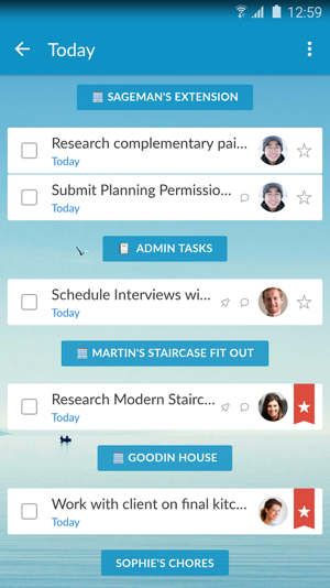
A successful freelancer usually has to juggle jobs from multiple clients. As someone running your own business, you want as much work as possible. That’s how you meet your financial goals and grow your reputation. At times, though, keeping track of your assignments is difficult. Wunderlist is a list-making app that will help you stay organized so you never miss another deadline.
Some helpful extra features include:
Alarms that remind you of deadlines
Collaboration tools so you can work with clients and colleagues
Working as a freelancer gives you a lot of freedom to choose projects that interest you and to set your own hours. Sometimes, though, your lazy side will try to undermine your ambitious side. Unfortunately, that can happen when you’re trying to beat a tight deadline.
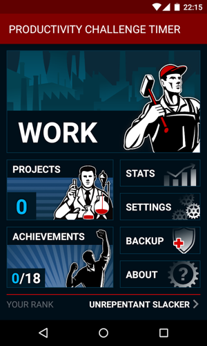
The Productivity Challenge Timer makes it easier to avoid distractions by encouraging you to focus on work. Productivity Challenge Timer is loosely based on the Pomodoro Technique, which breaks lengthy chores into smaller components so you can remain focused. It’s hard to stay on task when you’re writing a lengthy article that will take three hours. Breaking the assignment into 25-minute chunks, however, makes it relatively easy.
The Productivity Challenge Timer makes Pomodoro more fun by adding wacky alarms and irreverent titles. If you don’t meet your goals, your rating will eventually fall to Unrepentant Slacker.
FreshBooks
Operating system: Android and iOS
Price: Memberships start at $12.95 per month
Just because you’re a great writer, illustrator, or photographer doesn’t necessarily mean you have the accounting skills you need as a freelancer. That’s why you need an app like FreshBooks, which comes with several useful features to help you:
Create and send invoices to your clients
Accept credit card payments
Track your business expenses
Determine how much time you spend on certain tasks
Generate reports for payments collected, taxes, and other subjects
FreshBooks is clearly designed to make accounting easy for people who don’t want to spend much time going through records or doing math. Much of it is automated, so you can spend your time working on assignments that earn you money instead of wasting effort trying to get paid.
Shake
Operating system: Android and iOS
Price: Personal use is free. Professional accounts start at $10 per month.
Legally binding agreements make it possible for you to hold clients accountable for payment. Hiring a lawyer, however, costs so much that few freelancers will bother taking that step. With Shake, you get the benefit without the expense.
Shake gives its members access to a large library of agreements, contracts, and other legal documents. Freelancers should pay particular attention to documents that:
Describe payment terms
Name the owner of creative work
Create an independent contractor relationship
Prevent parties from sharing proprietary information
Shake is free for personal use, which means you get to use its starter forms to create, sign, and send agreements to your clients. Professional memberships start at $10 per month. By upgrading to a pro account, you can:
Personalize and brand your agreements
Get unlimited access to Shake’s library
Attach photos to your agreements
The apps you download to your phone can make your life a lot easier. Whether you’re an established freelancer or you’re trying to start a new career, it’s worth adding these apps to your mobile device.
2015 witnessed a lot of changes and innovations, but 2016 has a lot more in store. With more people accessing the Internet via mobile devices than desktop computers, a sharp and continued decline in human attention span, and web users becoming increasingly impatient, the web design community is in for a treat this year.
If you are a web designer, or even if you have a website, you should pay attention to the following trends in 2016:
Stickers are widely underutilised by businesses and organisations, which is a huge shame, as they have the potential to be one of the greatest marketing tools out there.
They’re especially good if you’re looking to build up brand awareness for your company, as stickers often end up in places that you would never expect them to end up (e.g. street lamps, cars, laptop cases, bins, you name it).
One of the problems that organisations tend to face is that they’re never quite sure how to use stickers to their advantage, and therefore, they often get confused as to what attributes make a good sticker design and what don’t.
If this sounds like you (or your organisation), then help is at hand, as we’ve created this simple sticker design guide to walk you through the process.
There’s no mumbo-jumbo here, just epic tips for creating the sort of sticker that gets results.
Let’s begin:
Do Not Overload Your Sticker With Text/Information (i.e. keep it as simple as possible)
Perhaps one of the most common mistakes that organisations make when it comes to sticker design is this: overloading them with far too much information and text.
Usually (i.e. 99% of the time), stickers have one sole purpose: to create brand awareness for your company/business/charity.
Unlike flyers, leaflets or brochures, the aim of a sticker isn’t to inform your target audience about every product/service you offer and how they may benefit them; it’s simply to let them know that you exist. There’s a big difference.
For example, take a look at the sticker above created on behalf of NASA; one of the largest organisations in the world.
Now, what’s the first thing you notice?
For me, it’s the fact that the sticker contains virtually no written information whatsoever. In fact, the only written text is does contain is the word “NASA” (which is also the logo) and a short strapline saying “Mars atmosphere and volatile evolution”.
You’ll notice that it doesn’t “bang on” about how they send rockets into space, or send astronauts to the moon. That job is left to other marketing materials (e.g. brochures, leaflets, etc.).
The sole purpose here is to create brand awareness for NASA (I know, they’re pretty well known already, right?).
If, for whatever reason, there is a vital piece of information that you must incorporate into your sticker design (perhaps its going to be used to instruct someone on how to use a certain product, for example), then simply make sure that your information doesn’t detract from the overall design of the sticker.
You can see a good example of how to do this above (the HD Eyes sticker).
This sticker clearly has a use as a directional aid and therefore, it contains information on how to use the product (a lens cleaner, in this case).
However, the directional information doesn’t detract from the overall beauty and simplicity of the sticker. The information is written in a small font size on the very edge of the sticker; therefore, you probably wouldn’t even notice it if you were viewing the sticker from a distance.
This is a great example of how to serve a legitimate purpose with a sticker, whist maintaining the brand building capabilities naturally incorporated into every eye-catching sticker design.
Make Sure Your Sticker is Bright and Colourful (or at least super contrasting)
I know what you’re thinking: “that sounds like quite a generic piece of advice”, and you’re right, but there’s virtually no sticker that won’t benefit from a bright and colourful design.
Why? Because stickers are generally viewed from a distance, so they need to be colourful and bright in order to stand out.
You can see a great example of a colour and bright sticker above. The pink colour really grabs your attention; even you’re quite a distance away from the sticker itself.
Somewhat contradictory to this logic, however, it’s not always about making the sticker as bright as possible; if it were, every sticker you ever see would be a bright yellow, pink or orange colour.
It’s equally as much about creating a sticker that comes across as bright and colourful to your intended target audience.
For example, the sticker featured above (the bright pink one) may be extremely bright and colourful, but do you really think it would come across as bright and eye-catching to a 40-year old male with no interest in jewels or glamour?
It’s unlikely, as pink is typically more of a colour associated with the female gender (obviously, that’s a generalisation, but you get the point).
If your target audience happened to be graphic designers, for example, creating a subtler sticker (like the Comic Sans Criminal sticker above) might come across as brighter in their eyes.
Sure, some of these stickers still make use of bright colours (e.g. red, green, etc.), but they’re by no means on the same scale as bright pink.
On the other hand, if you were targeting a young, fashion-conscious, rock-music-loving crowd, the sticker above (Drop Dead) might appear brighter and more eye-catching to them (mainly because of the “coolness” of the sticker).
Basically, “brightness” is a relative term when it comes to sticker design.
It’s as much about contrast as it is brightness, too. For example, the colours black and white are two contrasting colours (the colours used for the “Drop dead” sticker), as are pink and white (the colours used for the “Southern Jewlz” stickers).
So, if making a super-colourful sticker doesn’t align with your particular brand, at least make sure the colours you make use of are highly contrasting, and you’ll be well on your way to success.
Another thing to keep in mind is the intended placement of your sticker, as this will affect your design decisions.
By intended placement, I mean the place or places that you expect your sticker to end up.
Depending on the exact nature of your sticker, this might be harder to pinpoint for some than others.
For example, if you take a look at the Apple MacBook sticker example above, you’ll realise that the intended placement of these stickers is pretty much guaranteed, as they’re made solely for placement on Apple MacBook computers.
If you’ve ever seen a MacBook (or happen to own one), you’ll know that all MacBook’s are the exact same colour and also, they all feature the white light-up Apple logo in the centre on the lid.
This makes designing stickers for this purpose easy, as you know the characteristics of the intended placement location (i.e. a matt grey colour with white Apple logo).
Note: In the example above, the sticker is the large image of the “ski legs” on the backseat table.
The thing is, when you’re creating stickers for your business, there might not be one sole intended placement location. In fact, in some cases, your stickers could end up pretty much anywhere.
One option is to utilise a white border like the sticker design above from Go Media.
You’ll notice that if this sticker happened to be stuck to a dark black surface, the sticker would still stand out thanks to the white border. If, on the other hand, it was stuck to a light white surface, the white border may become invisible (at least from a distance), but the overall design of the sticker would remain intact.
It’s a simple technique, but it’s an effective one that can be used for just about any design (including your own).
Conclusion
To conclude, sticker design doesn’t have to be that hard; you simply have to understand the aim of your sticker (usually to build brand awareness), make sure it’s bright and colourful, and make sure it stands out wherever it is likely to be placed.
Sure, it isn’t always an easy thing to pull off, but if you follow the advice laid out above, you should be well on your way to creating a stunning, impactful sticker that generates a good return on investment for your business (or your clients business).
Remember, it’s also important to keep the target audience in mind (as briefly mentioned in the point about brightness/colourfulness above). Your aim is rarely to build brand awareness throughout the entire population, but rather the select group of people that make up your target audience.
This will vary from organization to organisation, so make sure you understand your target audience as much as possible. Figure out what they’re likely to do with your sticker, what design aspects would ensure that they make use of it, where they’d stick it, etc.
The more you know, the more success you’ll experience.
Bio: Joshua is an extremely passionate designer from the UK. He works for a printing company, where he teams up with clients to create sensational designs that skyrocket their business on a day-to-day basis.
Great read on responsive design. Should you use it or not, what are the draw backs? Consider budgets and time and what framework is best for you and your clients.
One of the many benefits of being a freelance designer or web developer is that you can work with clients from all over the world. For a qualified, astute, and industrious designer, the Internet can provide enough projects for you to bid every day.
But, this benefit is not without an accompanying downside. It takes time to bid on projects. Lots of time. Often, you can bid on 10-20 projects before acquiring a single job. More than likely, you start the bidding process before some of your other projects are finished to create continuity in your freelance work.